Thursday, May 20

imagination bubble.

last night i decided to start on my final piece, i printed off three copies of the conductor guy on the peachy cream background to allow myself to experiment further with paint and shape ideas.


i used oil paint on all three, my favourites right now are the black and orange and i cant decide between the two so i plan to just continue working on both until i have a clear winner. i think that the orange will work best though as i dont think the ink would pop out against the black as well as it would against the orange.

bleach and ink experiment.

in my final image i decided i wanted to have some text but after having a quick scan of 'dafont' website i decided that although i really like the handwritten fonts, i wanted it to be more personal and unique, to be something that i had actually created myself. recently i have also been doing alot of experimenting with ink and bleach and the effect they have when combined together, thus i have decided to create a section of the image were it will be ink and then written with bleach.


so i was just sort of experimenting with the word imagine, as my final piece i think will be all about imagination, random thoughts and quandries that have come from images i have taken, things i have painted or magazine cut outs. my favourite from these three scans is 'imagine, imagine, imagine.' i would be happy to include this although i am considering work in a quote specifically about the mind and its capicity to imagine and conjour up images, and how amazing that is.

Wednesday, May 19

first attempt at final image.

i used the sharp mask tool to select the guys body and then the paint bucket tool to colour the backdrop a sort of light beachy cream colour, so its still almost white but now quite.


the step for me with this will be to paint the sort of speach/thought bubble area, at the moment im thinking about doing it in either a vibrant deep orange or a rich blue, will mix in white like around the edges though i think...

rough draft.

this is a rough draft of where i envisage my final image in going. sort of like a train of thought, or lots of trains of thought. hopes. dreams. aspirations. lots of colour, tone and texture. painting lots, which will require lots of scanning, so will mean coming in and out the computer alot.

snaps.

at the weekend i took some photos of my friends and i quite like these two, thought perhaps i could use the quick mask tool to select around the figures, even though very dimly lit. but kind of think the lack of quality and not being able to make much out about them adds to there aestetic quality. perhaps experimentation at a later stage...


magazine cuttings.

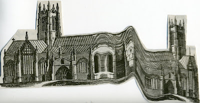
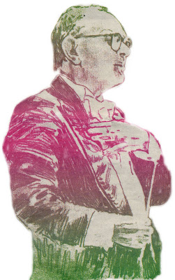
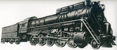
i was looking through a free newspaper i had got the other day called 'the pigeon stool', when i came across a few bits and pieces and i thought i could use for my final piece. so i cut them out and scanned them in..

the first is of a man, sort of conductor looking. i was drawn to him for the colour and rough appeal to him. i have an idea that could make him the focal point of my final piece.


the second is of a train, i thought it was quite interesting and want to find a way to incorporate into my finished print.


the last was a chruch, slightly unusual looking, slanted and curved building. once again thought i might be able to incorporate it into to piece somehow.

Tuesday, May 18

landscape contact.

as mentioned last week here is the scanned in negs from my landscape shoot that i did over the weekend. i was trying to either find something i could use as a partial or whole back drop, whether that be the sky, or the outline of the top of the buildings.


Monday, May 17

vault49.

i was looking on the vault49 website for inspiration as to what i could do for my final piece and i came across this seiries of illustrations, designed showcase the many employment possibilities within the UK Civil Service. There idea combines a series of vector and hand-drawn illustrations with paper cut-outs. i kind of would like to do something similar pehaps coming from the mans hand with paint and magazine cut outs?

fonts.

i have been looking recently at dafonts webiste in search of some interesting fonts which i could possibly incorporate into my final image. so far i have found three handwritten ones 1 2 3

and then also i quite like the sort of typewriter styles 1 2 3

stencil.

i have a stencil at home that i really like using and experimenting with, i had an idea that has the final part of my image i could work on top of it with maybe one or two letters like continually repeated ontop of one another in a section (experimental image to follow.)

painting.

over the weekend i tried to experiment with different ways to colour in my man. i found the whole process quite hard and fiddly and dont think it went too well, it just doesnt look right, i now feel i have to options, either get another photocopy of the man but at an a3 size so the spaces which need painting are bigger or get the trace re-photocopied but just draw around the outline, so he is more of a shape than a mish mash of colour. at the moment i am leaning to the latter of the two options.


this is the painted image i did over the weekend, it just isnt how i wanted it to look plus, i feel if the figure is transparent it might break up whatever is going on behind him. i would like to incorparate paint and the texture that gives in some area of my final image though.

Thursday, May 13

painting with photoshop.

here is the image i painted using photoshop. it is quite rough and not very neat but i think it shows what i was trying to acheive. i used the paint brush tool on photoshop and the colour palette to create big blocks of colour which have no tonal range. from this i have decided that i want to most definately experiment with actual painting as i think it will look more interest and have a better tonal range, easier to blemnd, show defination, high and low lights.


the next step is to try this out at home, i will try it both with this block technique and also with a more blended and defined approach.