
play 2 for me has been a really interesting project, it has enabled me to use photoshop in a different and new way to that of what i was previously used to.
i enjoyed being so creative, painting and scanning, quoting text etc and also being able to just experiment with any ideas i had. there was no fixed ideas, or specific things we had to do, it was a more fluid project i feel. i think i have learnt a lot about photoshop from this project and developed by small skills in the programme slightly further.
i think my final image perhaps should have included an actual photograph in it, but i do feel that prior to reaching that final point i did experiment broadly with a range of ideas and techniques.
if i was to do this project over i think i would proably have just experimented even more, just worked more and more with my ideas which perhaps would have helped me to produce a more diverse final image, with more textural range and range of techniques that i had used. i proably also would have got going on this project alot more but i didnt manage my time amazingly well and honestly the project was forced to take a back seat when i became snowed under with my final major project work.
taking all those factors into mind i do still feel that this was project was a good one, and also i good learning curve, it took me out of my comfort zone in terms of photographic genres and forced me to experiment in ways i'm sure i would never normally have done before.
Monday, May 24
Friday, May 21

more inspirations.
looking at the work of bill mcconkey, his work is heavily drawn illustrations, perhaps the sort of work that would be edited through illustator or a combination of scanning and graphics worked in together.
another artist sarah howell, whose work is like lots of layers and different aspecrts of situations built up on top of one another, which creates some quite busy imagery. also photographs quite prominant, like a key starting point / focal feature.
jack daw, once again photographs are quite prominant in his work, sort of seem like the base idea and then he build on them graphically, lots of mark making and spirals going on infront and behind the figures featured in his work.
marina caruso, her work i would presume would have orginally derived from pictures of people which have then been edited to appear more like drawings / sketches, will lots of different textures and patterns going on in within them.
debutart was a site we were given on the brief and was just crammed full of lots of individual graphic desginers work. i found lots of other artists work i liked that werent on the brief..
alex trochut, whos work is like lots of illustrated words. really interesting and different to alot of the other stuff i had looked at. uses words to illustrate something. other pieces seem very sort of hand drawn, sketched, scanned worked on in illustator or some other graphic based programme. really nice vivid colours aswell.
chubbs, people in lots of different enviroments, people seem to lack a sense of identity, no real facial features or high detail in there clothing. sort of sense of narrative to them. also quite obscure to look at as they have no real face, lacking who they are, becomes more about there enviroment.
wesley merritt, serious of sketches, quite structure but not life like. there isnt alot of colour going on in them, more about whats there, and seems like he wants it to be obvious that he has drawn them himself?
yehrin tong, lots of patterns and textures all sort of built up on top of one another. incorparates sketches and people into some of the pieces aswell. just lots of layering one on top of the other.
last edits.
basically i feel that i have arrived at my final image, it is now just a case of choosing between two options..

my favourite is definately the bottem one, with just the biro as i think it comes out more and the corrective fluid just was too much.

my favourite is definately the bottem one, with just the biro as i think it comes out more and the corrective fluid just was too much.
textured smoke.
as mentioned before i was planning on using a texture in the cloud area, which i have now done:
now all thats left is to add the quote to the bottem, will experiment with both using the corrective fluid and biro alone.
also have noticed how the more and more i have scanned this in, the more intense the grain has become, which has become really interesting.

now all thats left is to add the quote to the bottem, will experiment with both using the corrective fluid and biro alone.
also have noticed how the more and more i have scanned this in, the more intense the grain has become, which has become really interesting.
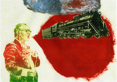
train smoke.
so i wanted the train to have smoke coming out of it, i printed off a wax print of where my print was up to and then painted using oil paint, smoke coming out of the top of the train.
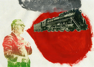
the next stage will be to use my texture from my mount board and have it underneath the cloud, then use the rubber tool at a low opacity so it seeps through the cloud but its not really harsh against the rest of the picture.

the next stage will be to use my texture from my mount board and have it underneath the cloud, then use the rubber tool at a low opacity so it seeps through the cloud but its not really harsh against the rest of the picture.
stencil experimentation.
as i said in my previous post i have now decided on my quote the next stage for this was to experiment with how i was going to present it. the first idea was to use my stencil on plain white paper scan it in and layer it over the top.
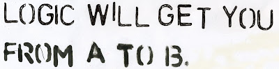
for the top line i used a black biro and for the bottom i used a thick black felt tip. i preferred the biro overall though and will use this to develop my final further.
the next step i took was to use correction fluid over the top of my red thought bubble and then use the stencil and black biro to write over the top.
i quite like this and will try it again when my image is nearly complete, ready for this stage. will also try just writing straight onto the red backdrop although concerned this wont show up as well, all the correction fluid adds a new texture to it.

for the top line i used a black biro and for the bottom i used a thick black felt tip. i preferred the biro overall though and will use this to develop my final further.
the next step i took was to use correction fluid over the top of my red thought bubble and then use the stencil and black biro to write over the top.

i quite like this and will try it again when my image is nearly complete, ready for this stage. will also try just writing straight onto the red backdrop although concerned this wont show up as well, all the correction fluid adds a new texture to it.
quotes.
as mentioned before i was thinking about having a quote at the bottem of my thought bubble in my final piece. last night i had a look for some interesting quotes too do with the imagination, heres what i came up with:
1. 'you can't depend on your eyes when your imagination is out of focus' Mark Twain.
2. 'the world is but a canvas to our imaginations' Henry David Thoreau.
3. 'everything you can imagine is real' Pablo Picasso.
4. 'imagination rules the world' Napolean Bonaparte.
5. 'i can believe anything provided it is incredible' Oscar Wilde.
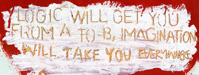
6. 'logic will get you from a to b, imagination will take you everywhere' Einstein.
i think the quote best fitting it 6, by einstein. not only does it reflect what im trying to say it also links into the train withen my image.
1. 'you can't depend on your eyes when your imagination is out of focus' Mark Twain.
2. 'the world is but a canvas to our imaginations' Henry David Thoreau.
3. 'everything you can imagine is real' Pablo Picasso.
4. 'imagination rules the world' Napolean Bonaparte.
5. 'i can believe anything provided it is incredible' Oscar Wilde.
6. 'logic will get you from a to b, imagination will take you everywhere' Einstein.
i think the quote best fitting it 6, by einstein. not only does it reflect what im trying to say it also links into the train withen my image.
Thursday, May 20
more development of final piece.
okay so i know have a kind of fixed idea of where i think i'm going with my final image, i envisage the train to have smoke coming out of it, will intially use to paint to create this but then will scan in to the computer and used my scanned in textured from my mount board to become the smoke.
then i will print it off again and use a stencil in the bottom half of the red thought bubble, of a quote of some kind, possibly realating to the mind and what a powerful tool it can?
then i will print it off again and use a stencil in the bottom half of the red thought bubble, of a quote of some kind, possibly realating to the mind and what a powerful tool it can?
patrick morgan
i have been looking at his website for his inspiration as he uses alot of textures and has a lot of built up layers in his work. i really like the mixture of hand draw and graphic element his work has to it.
he has done some really nice pencil and digital media drawings of francis bacon
HERE interesting mixture of the two like i was discussing before and feel very built up.
he has done some really nice pencil and digital media drawings of francis bacon
HERE interesting mixture of the two like i was discussing before and feel very built up.
vault49
after looking at vault49's website i cam across some more projects which i found interesting.
the first being 'cityscape', an almost doodle like looking project designed to give a reperesentation of what like london and new york are like. they are lots of little drawings put together to produce one final piece, including lots of cliches like the red double decker bus and mickey mouse.
another project was 'iso-lion', an interesting mix of sketches and graphics. also a mash up of colour and black and white areas. a combination of hand-drawn sketches and vector graphics as cut-outs, layered up, balanced on play-doh, and photographed to show the craftsman's touch. almost like a pop up book.
experimenting with the train.
so i started to experiment with how the train might fit into the image. the next step is to now i think add paint for the smoke, like coming out of the chimney and then im thinking musical notes, a truck with a stencil and then either a quote or text to get to my final image.


Subscribe to:
Comments (Atom)