
play 2 for me has been a really interesting project, it has enabled me to use photoshop in a different and new way to that of what i was previously used to.
i enjoyed being so creative, painting and scanning, quoting text etc and also being able to just experiment with any ideas i had. there was no fixed ideas, or specific things we had to do, it was a more fluid project i feel. i think i have learnt a lot about photoshop from this project and developed by small skills in the programme slightly further.
i think my final image perhaps should have included an actual photograph in it, but i do feel that prior to reaching that final point i did experiment broadly with a range of ideas and techniques.
if i was to do this project over i think i would proably have just experimented even more, just worked more and more with my ideas which perhaps would have helped me to produce a more diverse final image, with more textural range and range of techniques that i had used. i proably also would have got going on this project alot more but i didnt manage my time amazingly well and honestly the project was forced to take a back seat when i became snowed under with my final major project work.
taking all those factors into mind i do still feel that this was project was a good one, and also i good learning curve, it took me out of my comfort zone in terms of photographic genres and forced me to experiment in ways i'm sure i would never normally have done before.
Monday, May 24
Friday, May 21

more inspirations.
looking at the work of bill mcconkey, his work is heavily drawn illustrations, perhaps the sort of work that would be edited through illustator or a combination of scanning and graphics worked in together.
another artist sarah howell, whose work is like lots of layers and different aspecrts of situations built up on top of one another, which creates some quite busy imagery. also photographs quite prominant, like a key starting point / focal feature.
jack daw, once again photographs are quite prominant in his work, sort of seem like the base idea and then he build on them graphically, lots of mark making and spirals going on infront and behind the figures featured in his work.
marina caruso, her work i would presume would have orginally derived from pictures of people which have then been edited to appear more like drawings / sketches, will lots of different textures and patterns going on in within them.
debutart was a site we were given on the brief and was just crammed full of lots of individual graphic desginers work. i found lots of other artists work i liked that werent on the brief..
alex trochut, whos work is like lots of illustrated words. really interesting and different to alot of the other stuff i had looked at. uses words to illustrate something. other pieces seem very sort of hand drawn, sketched, scanned worked on in illustator or some other graphic based programme. really nice vivid colours aswell.
chubbs, people in lots of different enviroments, people seem to lack a sense of identity, no real facial features or high detail in there clothing. sort of sense of narrative to them. also quite obscure to look at as they have no real face, lacking who they are, becomes more about there enviroment.
wesley merritt, serious of sketches, quite structure but not life like. there isnt alot of colour going on in them, more about whats there, and seems like he wants it to be obvious that he has drawn them himself?
yehrin tong, lots of patterns and textures all sort of built up on top of one another. incorparates sketches and people into some of the pieces aswell. just lots of layering one on top of the other.
last edits.
basically i feel that i have arrived at my final image, it is now just a case of choosing between two options..

my favourite is definately the bottem one, with just the biro as i think it comes out more and the corrective fluid just was too much.

my favourite is definately the bottem one, with just the biro as i think it comes out more and the corrective fluid just was too much.
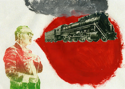
textured smoke.
as mentioned before i was planning on using a texture in the cloud area, which i have now done:
now all thats left is to add the quote to the bottem, will experiment with both using the corrective fluid and biro alone.
also have noticed how the more and more i have scanned this in, the more intense the grain has become, which has become really interesting.

now all thats left is to add the quote to the bottem, will experiment with both using the corrective fluid and biro alone.
also have noticed how the more and more i have scanned this in, the more intense the grain has become, which has become really interesting.
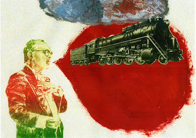
train smoke.
so i wanted the train to have smoke coming out of it, i printed off a wax print of where my print was up to and then painted using oil paint, smoke coming out of the top of the train.
the next stage will be to use my texture from my mount board and have it underneath the cloud, then use the rubber tool at a low opacity so it seeps through the cloud but its not really harsh against the rest of the picture.

the next stage will be to use my texture from my mount board and have it underneath the cloud, then use the rubber tool at a low opacity so it seeps through the cloud but its not really harsh against the rest of the picture.
stencil experimentation.
as i said in my previous post i have now decided on my quote the next stage for this was to experiment with how i was going to present it. the first idea was to use my stencil on plain white paper scan it in and layer it over the top.
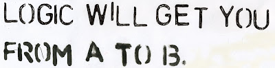
for the top line i used a black biro and for the bottom i used a thick black felt tip. i preferred the biro overall though and will use this to develop my final further.
the next step i took was to use correction fluid over the top of my red thought bubble and then use the stencil and black biro to write over the top.
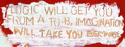
i quite like this and will try it again when my image is nearly complete, ready for this stage. will also try just writing straight onto the red backdrop although concerned this wont show up as well, all the correction fluid adds a new texture to it.
quotes.
as mentioned before i was thinking about having a quote at the bottem of my thought bubble in my final piece. last night i had a look for some interesting quotes too do with the imagination, heres what i came up with:
1. 'you can't depend on your eyes when your imagination is out of focus' Mark Twain.
2. 'the world is but a canvas to our imaginations' Henry David Thoreau.
3. 'everything you can imagine is real' Pablo Picasso.
4. 'imagination rules the world' Napolean Bonaparte.
5. 'i can believe anything provided it is incredible' Oscar Wilde.
6. 'logic will get you from a to b, imagination will take you everywhere' Einstein.
i think the quote best fitting it 6, by einstein. not only does it reflect what im trying to say it also links into the train withen my image.
Thursday, May 20
more development of final piece.
okay so i know have a kind of fixed idea of where i think i'm going with my final image, i envisage the train to have smoke coming out of it, will intially use to paint to create this but then will scan in to the computer and used my scanned in textured from my mount board to become the smoke.
then i will print it off again and use a stencil in the bottom half of the red thought bubble, of a quote of some kind, possibly realating to the mind and what a powerful tool it can?
then i will print it off again and use a stencil in the bottom half of the red thought bubble, of a quote of some kind, possibly realating to the mind and what a powerful tool it can?
patrick morgan
i have been looking at his website for his inspiration as he uses alot of textures and has a lot of built up layers in his work. i really like the mixture of hand draw and graphic element his work has to it.
he has done some really nice pencil and digital media drawings of francis bacon
HERE interesting mixture of the two like i was discussing before and feel very built up.
he has done some really nice pencil and digital media drawings of francis bacon
HERE interesting mixture of the two like i was discussing before and feel very built up.
vault49
after looking at vault49's website i cam across some more projects which i found interesting.
the first being 'cityscape', an almost doodle like looking project designed to give a reperesentation of what like london and new york are like. they are lots of little drawings put together to produce one final piece, including lots of cliches like the red double decker bus and mickey mouse.
another project was 'iso-lion', an interesting mix of sketches and graphics. also a mash up of colour and black and white areas. a combination of hand-drawn sketches and vector graphics as cut-outs, layered up, balanced on play-doh, and photographed to show the craftsman's touch. almost like a pop up book.
experimenting with the train.
so i started to experiment with how the train might fit into the image. the next step is to now i think add paint for the smoke, like coming out of the chimney and then im thinking musical notes, a truck with a stencil and then either a quote or text to get to my final image.


imagination bubble.
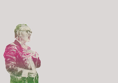
last night i decided to start on my final piece, i printed off three copies of the conductor guy on the peachy cream background to allow myself to experiment further with paint and shape ideas.
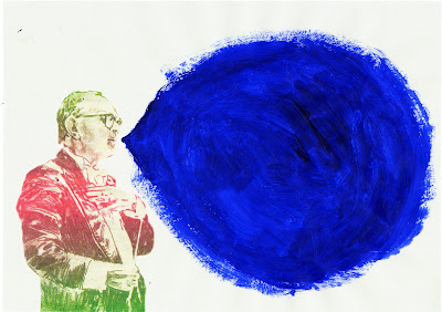
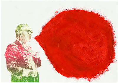
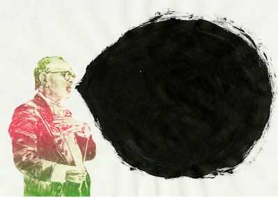
i used oil paint on all three, my favourites right now are the black and orange and i cant decide between the two so i plan to just continue working on both until i have a clear winner. i think that the orange will work best though as i dont think the ink would pop out against the black as well as it would against the orange.


i used oil paint on all three, my favourites right now are the black and orange and i cant decide between the two so i plan to just continue working on both until i have a clear winner. i think that the orange will work best though as i dont think the ink would pop out against the black as well as it would against the orange.
bleach and ink experiment.
in my final image i decided i wanted to have some text but after having a quick scan of 'dafont' website i decided that although i really like the handwritten fonts, i wanted it to be more personal and unique, to be something that i had actually created myself. recently i have also been doing alot of experimenting with ink and bleach and the effect they have when combined together, thus i have decided to create a section of the image were it will be ink and then written with bleach.
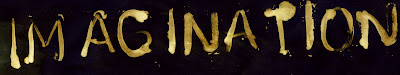
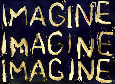
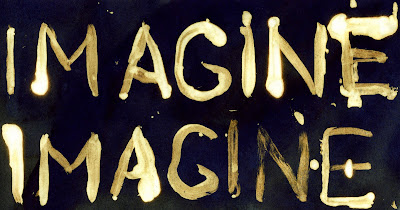
so i was just sort of experimenting with the word imagine, as my final piece i think will be all about imagination, random thoughts and quandries that have come from images i have taken, things i have painted or magazine cut outs. my favourite from these three scans is 'imagine, imagine, imagine.' i would be happy to include this although i am considering work in a quote specifically about the mind and its capicity to imagine and conjour up images, and how amazing that is.


so i was just sort of experimenting with the word imagine, as my final piece i think will be all about imagination, random thoughts and quandries that have come from images i have taken, things i have painted or magazine cut outs. my favourite from these three scans is 'imagine, imagine, imagine.' i would be happy to include this although i am considering work in a quote specifically about the mind and its capicity to imagine and conjour up images, and how amazing that is.
Wednesday, May 19
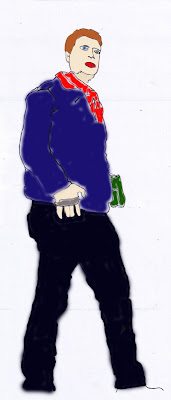
first attempt at final image.
i used the sharp mask tool to select the guys body and then the paint bucket tool to colour the backdrop a sort of light beachy cream colour, so its still almost white but now quite.
the step for me with this will be to paint the sort of speach/thought bubble area, at the moment im thinking about doing it in either a vibrant deep orange or a rich blue, will mix in white like around the edges though i think...

the step for me with this will be to paint the sort of speach/thought bubble area, at the moment im thinking about doing it in either a vibrant deep orange or a rich blue, will mix in white like around the edges though i think...
rough draft.
this is a rough draft of where i envisage my final image in going. sort of like a train of thought, or lots of trains of thought. hopes. dreams. aspirations. lots of colour, tone and texture. painting lots, which will require lots of scanning, so will mean coming in and out the computer alot.


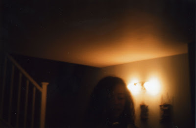
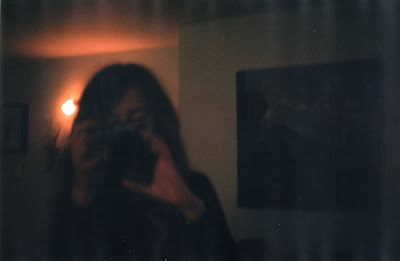
snaps.
at the weekend i took some photos of my friends and i quite like these two, thought perhaps i could use the quick mask tool to select around the figures, even though very dimly lit. but kind of think the lack of quality and not being able to make much out about them adds to there aestetic quality. perhaps experimentation at a later stage...


magazine cuttings.
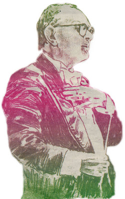
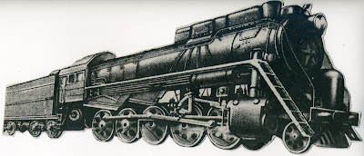
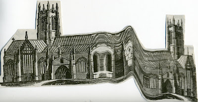
i was looking through a free newspaper i had got the other day called 'the pigeon stool', when i came across a few bits and pieces and i thought i could use for my final piece. so i cut them out and scanned them in..
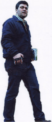
the first is of a man, sort of conductor looking. i was drawn to him for the colour and rough appeal to him. i have an idea that could make him the focal point of my final piece.
the second is of a train, i thought it was quite interesting and want to find a way to incorporate into my finished print.
the last was a chruch, slightly unusual looking, slanted and curved building. once again thought i might be able to incorporate it into to piece somehow.
the first is of a man, sort of conductor looking. i was drawn to him for the colour and rough appeal to him. i have an idea that could make him the focal point of my final piece.

the second is of a train, i thought it was quite interesting and want to find a way to incorporate into my finished print.

the last was a chruch, slightly unusual looking, slanted and curved building. once again thought i might be able to incorporate it into to piece somehow.

Tuesday, May 18
landscape contact.
as mentioned last week here is the scanned in negs from my landscape shoot that i did over the weekend. i was trying to either find something i could use as a partial or whole back drop, whether that be the sky, or the outline of the top of the buildings.


Monday, May 17
vault49.
i was looking on the vault49 website for inspiration as to what i could do for my final piece and i came across this seiries of illustrations, designed showcase the many employment possibilities within the UK Civil Service. There idea combines a series of vector and hand-drawn illustrations with paper cut-outs. i kind of would like to do something similar pehaps coming from the mans hand with paint and magazine cut outs?
stencil.
i have a stencil at home that i really like using and experimenting with, i had an idea that has the final part of my image i could work on top of it with maybe one or two letters like continually repeated ontop of one another in a section (experimental image to follow.)


painting.
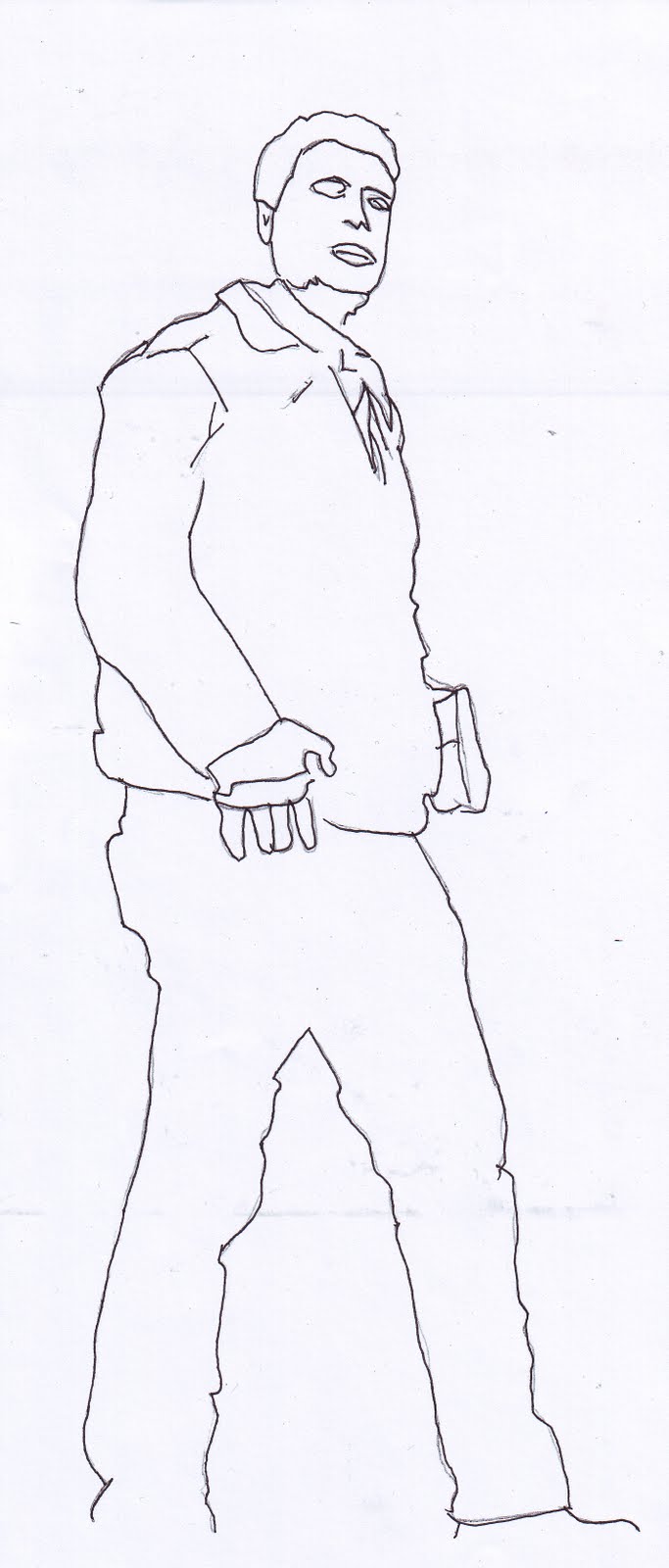
over the weekend i tried to experiment with different ways to colour in my man. i found the whole process quite hard and fiddly and dont think it went too well, it just doesnt look right, i now feel i have to options, either get another photocopy of the man but at an a3 size so the spaces which need painting are bigger or get the trace re-photocopied but just draw around the outline, so he is more of a shape than a mish mash of colour. at the moment i am leaning to the latter of the two options.
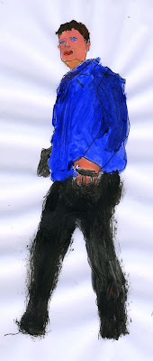
this is the painted image i did over the weekend, it just isnt how i wanted it to look plus, i feel if the figure is transparent it might break up whatever is going on behind him. i would like to incorparate paint and the texture that gives in some area of my final image though.

this is the painted image i did over the weekend, it just isnt how i wanted it to look plus, i feel if the figure is transparent it might break up whatever is going on behind him. i would like to incorparate paint and the texture that gives in some area of my final image though.
Thursday, May 13
painting with photoshop.
here is the image i painted using photoshop. it is quite rough and not very neat but i think it shows what i was trying to acheive. i used the paint brush tool on photoshop and the colour palette to create big blocks of colour which have no tonal range. from this i have decided that i want to most definately experiment with actual painting as i think it will look more interest and have a better tonal range, easier to blemnd, show defination, high and low lights.
the next step is to try this out at home, i will try it both with this block technique and also with a more blended and defined approach.

the next step is to try this out at home, i will try it both with this block technique and also with a more blended and defined approach.
Wednesday, May 12
scanning.
today i have been doing a far bit of scanning to hopefully work towards my final piece. firstly i scanned in this piece of mount which i had been working on in previous lessons. it has several layers of paint and newspaper which give lots of pattern and texture.
i started to sand away areas of the paint to reveal sections of newpaper underneath, most notably the numbers, 1 and 3 (shown here close up). this is also my favourite section of the collage and proably the only area i will work with as i feel that there is just too much going on everywhere else in the image.
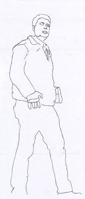
the next step i took was take a street photograph i had taken in rome from my flikr. intially i used the quick mast tool to select just the man, whom i then copied and pasted onto a white background.
i then printed it off and traced around it.
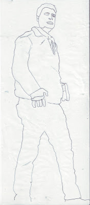
then i photocopied that and redrew over the faded lines on the photocopy. my next step will be to experiment with painting over the top of his body both in photoshop and by hand to see what gives the best results. want both to be done in a sort of block style.
over the next few days i will also be shooting some film of skylines with the plan to use as my basic background of my final image, scans should be up some time next week.

i started to sand away areas of the paint to reveal sections of newpaper underneath, most notably the numbers, 1 and 3 (shown here close up). this is also my favourite section of the collage and proably the only area i will work with as i feel that there is just too much going on everywhere else in the image.

the next step i took was take a street photograph i had taken in rome from my flikr. intially i used the quick mast tool to select just the man, whom i then copied and pasted onto a white background.

i then printed it off and traced around it.

then i photocopied that and redrew over the faded lines on the photocopy. my next step will be to experiment with painting over the top of his body both in photoshop and by hand to see what gives the best results. want both to be done in a sort of block style.
over the next few days i will also be shooting some film of skylines with the plan to use as my basic background of my final image, scans should be up some time next week.
Wednesday, March 17
mark making on masking tape.
same pretense as post below except i printed onto masking tape and covered it in masking fluid beforehand which has made it sort of more abstract and merge more together.

this is the image above except when i scanned in i turned the masking tpae back to front and i really like the effect this has given it. also like how both images look composistionally.


this is the image above except when i scanned in i turned the masking tpae back to front and i really like the effect this has given it. also like how both images look composistionally.

mark making.
product of messing about with paint, water and ink. quite experimental brush strokes and pen dabs. especially like the one with writing underneath and the way it comes through. could possibly make a brush of this or put over the top of something. could experiment with more colours...


photocopy scans.
i decided to scan these after getting some photocopies done and seeing the sort of repitive patern it made when the top section of the book was also copied. i like the tone and depth created and thought that perhaps i could incorperate these into an image, even if it is just for the shape.

this obviously happened by accident but i liked the effect that fact its only half visable and thought it fitted well with my other two scans (above.)


this obviously happened by accident but i liked the effect that fact its only half visable and thought it fitted well with my other two scans (above.)

digital negative.

i made my digital negative by first getting a digital file and desaturating the image, to make it change from colour to black and white. after this i used the curve tool to make sure the image had an even tonal range and good contrast.
then i made a new document, 'customs' and made it 8'10. i used the paint bucket tool to make the bottom layer completely black. select all of my orignal image and moved it on top of my new black one. then used the 'transform' tool with shift to make it to a sufficent size, lastly alligned the image so that it was compeletly in the middle.
the next step was to print the image on aesitate and then cut around the black border area. before going in the darkroom also had to make a frame to sit around the outside.
once in the darkroom used a large piece of glass ontop of the negative - to stop it from moving and creating light leaks (paper went underneath.) the rest normal darkroom porcedure.

final image was exposed for 12 seconds with grade 5. decided to keep the dust on it as felt it added to the quality of the image and could make it even more interesting in later editing stages.


Subscribe to:
Comments (Atom)